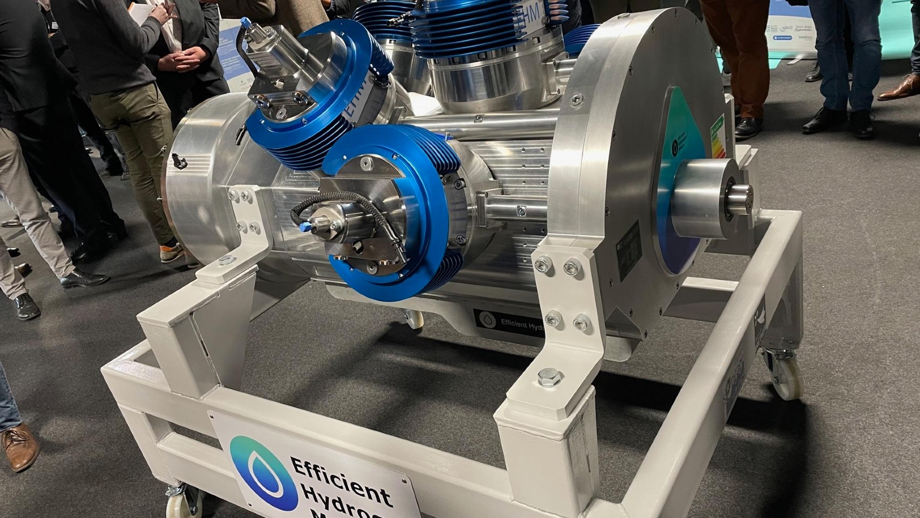
EVs are seen as an advance towards the future of mobility, but to what extent will they dominate the zero-emission car industry? What we have just learned could bring internal combustion, scorned as unsustainable, back to the forefront. This is the first 5-stroke hydrogen engine in history, with power that exceeds conventional engines and zero emissions.
EVs are faicing difficult production obstacles: FCEVs could end they them all
Electric vehicles (EVs) have been gaining popularity in recent years as consumers look for more sustainable transportation options. However, EVs face limitations in driving range, charging times, and upfront costs that have prevented widespread adoption.
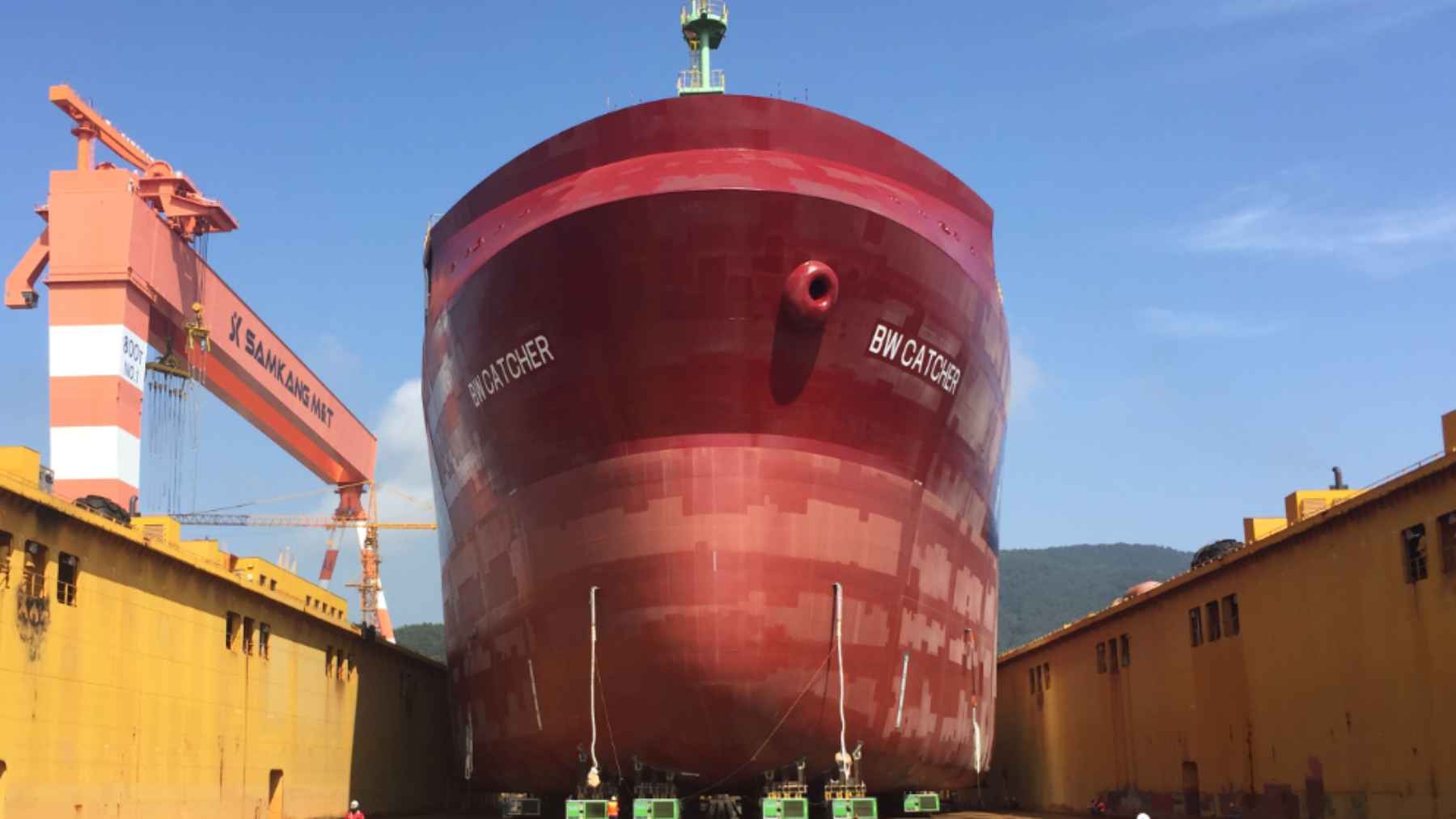
Hydrogen fuel cell cars can refuel faster than EVs can recharge and provide longer driving ranges comparable to gasoline vehicles. But hydrogen’s infrastructure for production, distribution and refueling stations remains lacking. Fuel cell vehicles also currently cost much more than EVs.
Some innovators are now exploring a different approach – hydrogen combustion engines. These engines burn hydrogen as fuel like gasoline engines burn petrol, rather than relying on fuel cells. The goal is to leverage existing internal combustion engine technology while taking advantage of hydrogen’s benefits as a clean fuel.
New 5-stroke hydrogen engine: the invention that could lead the way to future FCEVs
The 5-stroke hydrogen engine is an innovative new internal combustion engine designed to run on hydrogen fuel. Unlike conventional 4-stroke engines that power most vehicles today, the 5-stroke engine has an extra “idle” stroke that allows for the injection and ignition of hydrogen directly into the cylinder.
This hydrogen-powered engine was developed by the British company EHM to overcome some of the efficiency challenges of using hydrogen in standard engines. By adding an extra stroke specifically for hydrogen ignition, the fuel can be burnt more efficiently, extracting more energy from the hydrogen.
The 5-stroke cycle works by drawing air into the cylinder on the intake stroke, compressing it on the compression stroke, injecting a mist of hydrogen during the dedicated hydrogen stroke, igniting the hydrogen for the power stroke, and finally expelling exhaust gases on the exhaust stroke.
This unique sequence allows hydrogen’s properties to be fully utilized. The engine is designed for hydrogen direct injection, where pure hydrogen is injected at high pressure directly into the cylinder. This maximizes combustion to capture the most energy output from the minimal amount of fuel.
The 5-stroke process, at detail: that´s how this hydrogen engine works
The 5-stroke hydrogen engine operates on a unique 5-cycle process that allows it to run directly on hydrogen gas. This eliminates the need for hydrogen fuel cells and batteries like in electric vehicles.
The engine has 5 cylinders and pistons. Each cylinder goes through the following cycles:
-
Intake – Hydrogen gas is drawn into the cylinder through the intake valve
-
Compression – The hydrogen gas is compressed
-
Combustion – The compressed hydrogen is ignited by a spark and combusts
-
Gas exchange – The burned gas is pumped out and new hydrogen is brought in
-
Ignition – The hydrogen is ignited again for a second combustion
This 5-stroke process allows the engine to extract more energy from the hydrogen fuel as it combusts twice in each cylinder. The engine runs lean on a direct hydrogen injection system. The hydrogen gas is injected directly into the cylinders, eliminating the need for a conventional fuel system.
As you can see, the first 5-stroke hydrogen engine will follow the path of other prototypes we have seen, such as the one from Ferrari or AVL. However, in this case (and without wishing to make comparisons that would leave anyone in a bad place), it is an invention that aims to revolutionize internal combustion. Several years of development lie ahead, as the manufacturers themselves have pointed out.