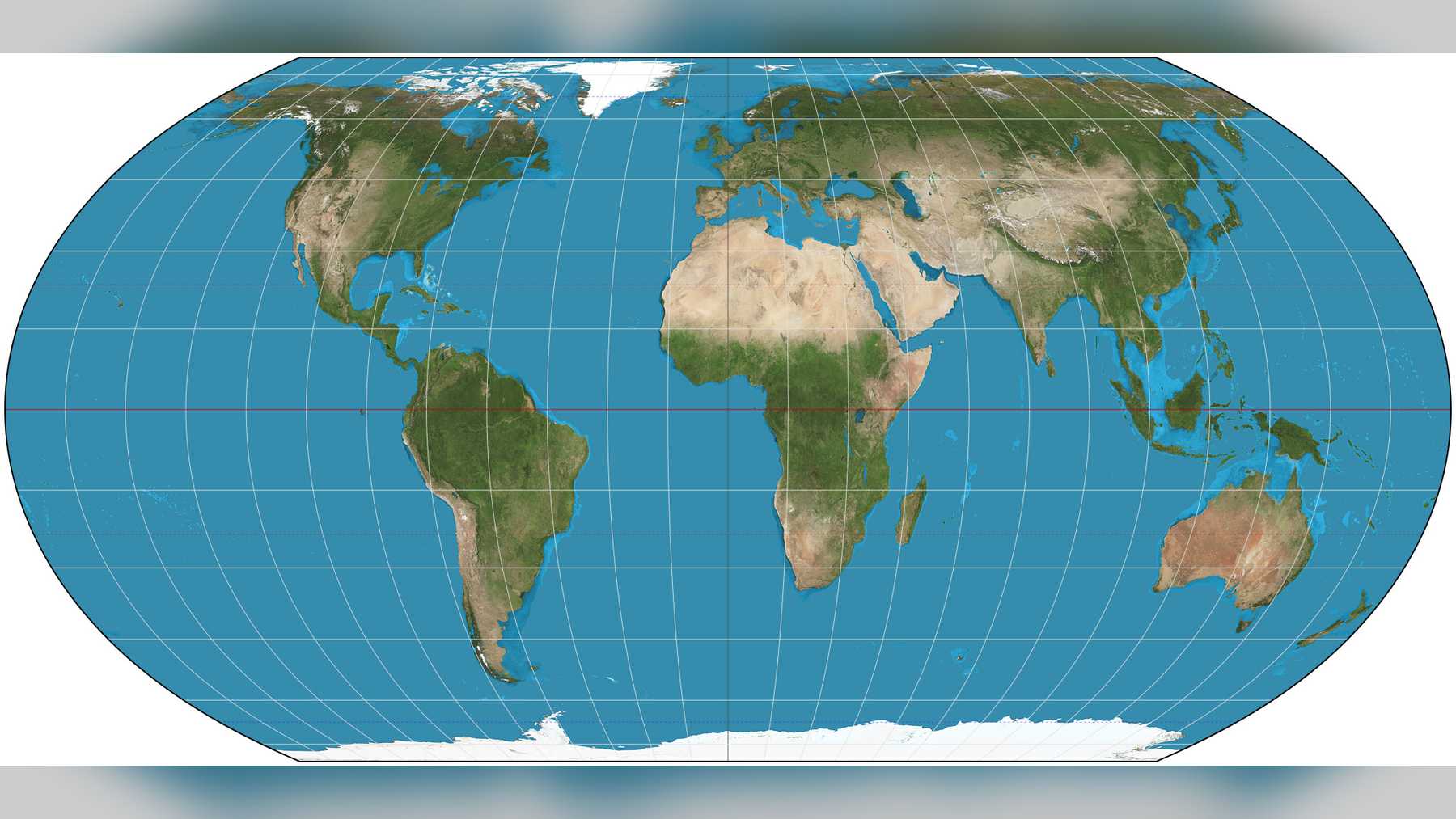
Tom Patterson had more or less retired from drawing maps for the U.S. national parks. Then the United Nations voted to promote Equal Earth, the world map he designed in 2018 with Bernhard Jenny and Bojan Šavrič, and governments started flooding him with questions. “It has been a very busy week for me,” he told the Guardian.
Japan, for one, complained that the disputed Kuril Islands were painted the same yellow as Russia on the annotated versions he gives away online. He has been switching colors and spellings since, Turkey to Türkiye among them. “I view the Equal Earth maps as living documents and am grateful for the many helpful suggestions that I have received,” he said.
The tally in the General Assembly on September 4, 2026, was 164 to 1, with six abstentions. On the map it encourages, Brazil looks nearly four times as large as Greenland, just as it is on the ground, and researchers in Argentina and Colombia told DW that Latin America gets the same boost in visibility that Africa’s campaign was after.
What the General Assembly voted for
Togo ran the talks. The “Correct the map” text, put forward by African Union states and the Bahamas, calls Equal Earth “a relevant option” and asks governments, schools and tech firms to reach for equal-area maps when size matters. The resolution (A/80/L.104) even names Latin America, with Africa and South Asia, among the places Mercator shrinks in people’s minds. What it doesn’t do, UN News pointed out, is ban Mercator or force a single replacement.
“To those who say why now, I say: why not?” Robert Dussey, Togo’s foreign minister, said before the vote, according to the Guardian. “When we look at the world map … it is time for us to change the narrative.” He went further: “It’s time for us in Africa to take responsibility to change what we can change ourselves.”
Why Mercator stretches the north
Gerardus Mercator drew his projection in 1569 for sailors. “He wanted a straight line to be drawn on a map to look like a straight line in reality if you followed a compass bearing,” James Cheshire, a professor of cartography at University College London, told the BBC. “That was what it was intended to do, and that’s what it does brilliantly well.”
Land gets bigger the farther it is from the equator, which is how Greenland ends up looking about as big as Africa, a continent roughly 14 times its size.
“All projections distort something, because going from a sphere to the two dimensions of the plane means sacrificing some geometric properties,” Carla Lois, a principal researcher at Argentina’s CONICET science council and a professor of cartography at the University of Buenos Aires, told DW in Spanish.
Sailors and pilots still rely on those angles, and on compasses that have had to keep up with a magnetic north pole that has shifted more than 1,400 miles, but hardly anyone plots a course off a classroom wall.
Three cartographers and an orange peel
The trio wanted a better-looking rival to Gall-Peters, an equal-area map that gets the sizes right but stretches the continents into long, drooping shapes.
“There was a lot of backlash from cartographers who said: ‘Well, it looks like clothes are hung up to dry,'” Bernhard Jenny, an associate professor at Monash University in Melbourne, Australia, told the Guardian.
Šavrič, a California-based software engineer, was the “maths wizard” of the group, according to the paper. The three took their cue from the rounded Robinson projection of 1963 but made every area come out true, and the design appeared in the International Journal of Geographical Information Science in August 2018.
“It’s like the orange peel analogy,” Jenny said. “You have to tear it and stretch it, and it’s not possible to flatten it out … so you have to make compromises.”
“It’s kind of a cartographer’s dream, right?” he said of the vote. “The fact that the UN is debating map projections for an entire hour is already totally thrilling for cartographers, and then it was our map projection. I mean, what else can you ask for?”
He joked that a “Šavrič-Patterson-Jenny projection” might not have done so well.
Brazil, Greenland and the view from Latin America
Brazil covers about 3.29 million square miles (8,515,770 square kilometers) and Greenland roughly 836,000 square miles (2,166,086 square kilometers), so the island fits into Brazil about four times, DW pointed out, and it is smaller than Argentina, too.
On Mercator, Greenland, which lost about 105 billion metric tons of ice in the year ending August 2025, can look bigger than all of South America.
“A country that measures, say, four million square kilometers [about 1.5 million square miles] will have a similar representation anywhere on the world map, regardless of the latitude where it sits,” Lois said of the new map.
“In symbolic terms, it gives Latin America, just like Africa, greater visibility on the world map. What might look like a silly detail is no small matter,” she said.
César Andrés Ospina, who teaches at the Institute of Regional Studies at the University of Antioquia in Colombia, told DW that “on the Mercator projection, the African continent and South America look very inferior to what we understand as the global north.” For him, Equal Earth’s rise is “the recognition of a hard struggle that has been taking place above all in the global south, regarding equity in cartographic representation.”
“It is no small matter that these territories have been represented as smaller in size than the others,” Ospina said. “That is part of a representation in the collective imagination of minimized, underdeveloped nations, without much legitimacy in their place in the world.”
He brought up President Donald Trump’s renaming of the Gulf of Mexico as the Gulf of America, which in his view shows that “cartography stops being a merely technical matter.”
Campaigners, critics and a French switch
Moky Makura, executive director of Africa No Filter, one of the groups behind the Correct The Map campaign, said in a statement that “now the real work begins.” “If we got something as basic as Africa’s size wrong for this long, what else about Africa have we simply accepted without questioning? Africa doesn’t need to be made bigger. It needs to be seen accurately,” she added, as quoted by Al Jazeera.
Kenyan geographer Kioko Muendo told the BBC that “maps are more than just guides for travellers – they shape how regions are perceived politically and economically.”
Washington was the lone no. Yaryna Ferencevych, the deputy U.S. representative to the UN Economic and Social Council, called resolutions like this one “barnacles on our work here.” Ukraine abstained over how Russian-occupied Crimea was shaded on Patterson’s annotated maps.
France’s foreign ministry is swapping Mercator for Eckert IV, a close cousin of Equal Earth, the Guardian reported. “Changing the map obviously doesn’t change the world. But correcting a representation that distorts it is already an act of truth,” Foreign Minister Jean-Noël Barrot said, according to the BBC.
What a new map leaves unchanged
Equal Earth squeezes countries near its edges, and the Guardian noted that New Zealand comes out stretched and distorted. “A map is never neutral,” Jenny said. “So you cannot please everyone.”
“What pleases me more is that this creates a valuable opportunity to strengthen map literacy and raise awareness that there is no single map projection capable of providing a completely ‘true’ representation of the world,” Šavrič said. “Every map projection involves trade-offs. I particularly appreciate that the [UN] resolution does not completely ban the Mercator projection or mandate a single replacement for all maps.”
Lois sees the limits. “In reality absolutely nothing changes … but on the symbolic level there is a tendency to represent the surfaces of all countries in a more equal way,” she told DW. Using it right away “is not going to replace an entire imaginary that we have built on Mercator projection maps,” she said, but she hopes the “automatic link between size and power, strength and dominance” will be “redefined or at least questioned.”
Google Maps still runs on a version of Mercator, and Jack Swab and Derek H. Alderman, geographers at the University of Tennessee, wrote in 2025 that “a person’s mental image of the world is solidified at a young age.” Nor can any projection show what nobody has seen: humans have directly observed less than 0.001% of the deep seafloor.
Togo plans an event in Lomé with UNESCO, the African Union and tech brands such as Google Maps in the first quarter of 2027 to work out how to apply the resolution, the Guardian reported.
Image: Strebe / Wikimedia Commons (CC BY-SA 4.0)